Stick to one space between sentences

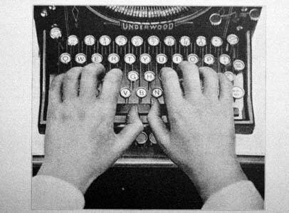
Typewriter keyboard
Things have changes since the days of the typewriter and one of those changes is spacing between sentences. The new rule in the publishing world and on the web is one space between sentences.
The two space rule between sentences applied to typewriters that used monospaced typefaces. Monospacing means that every letter regardless of how big or small took up the same amount of space. So a skinny little “i” took up as much space as a much wider “w.” So in order to help show the break between sentences, two spaces were recommended and eventually became an accepted practice.
Now with the advent of computers, monospaced typefaces have been replaced with proportional fonts, meaning each letter takes up the amount of space appropriate for its size and shape. This means that one space between sentences works well, it’s plenty of space to indicate a break and proportional fonts seem to make two spaces look like a gaping hole, which can be a bit disruptive to the reading experience.
As far as enforcing the one space rule between sentences, it really seems to depend on who you talk to. Some people are really hard core about enforcing one space, especially public relations staff, publishers and web designers. Others are more flexible and feel it’s a personal preference. Of course if you are in school, follow the guidelines your professor outlines. But if you are in the working world, it’s probably time to let two spaces go and stick to one space between sentences, it just looks better.

Leave a Comment